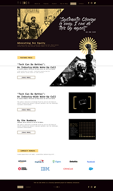
![TC[D]B website landing page](https://static.wixstatic.com/media/d8ed12_cffbec2e82ea4a259b97a57c42d790e2~mv2.png/v1/fill/w_655,h_435,al_c,q_85,usm_0.66_1.00_0.01,enc_avif,quality_auto/TCDB%20Screen2.png)
Tech Can [Do] Better
![TC[D]B logo](https://static.wixstatic.com/media/d8ed12_30387ff288f34f9fb58c36b753d0650c~mv2.png/v1/fill/w_247,h_247,al_c,q_85,usm_0.66_1.00_0.01,enc_avif,quality_auto/IG_print_announce.png)
Tech Can [Do] Better
They present valuable thought capital in order to drive racial equality in and through the tech industry while delivering actionable solutions to empower employees at every level to drive equitable, measurable, and enforceable policies.
Tech Can [Do] Better is an organization that exists to be the North Star and roadmap for how to be an equitable company and to embrace hiring diverse talent
Challenge
Tech Can [Do] Better is ready to make a digital home that serves as a hub for
all of their content. Their plan was to have the three main areas of the site offer informational, inspirational, and the actionable components.
Our goal was to create a website for Tech Can [Do] Better that could :
-
Serve an information hub for Community Members
-
Be a resource that could attract Network Members
-
Align future Corporate Affiliates
Research & Synthesis
Team:
Chip Auchincloss, UX Designer
Jacob Donadee, UX Designer
Amira Rivera, UX Designer
Kenneth Yeung, UX Designer
Duration:
3 week sprint for
client project
Tools:
-
Sketch
-
Miro
-
Photoshop
-
Google Suite
My Role:
-
User Interviews
-
Contextual Inquiries
-
Research Synthesis
-
Content Strategy
-
Information Architecture
-
UX/UI Design
Methods Used:
-
User Interviews
-
Affinity Map
-
Persona
-
Problem Statement
-
Information Architecture
-
Contextual Inquiry
-
Comparative Analysis
-
Site Map
-
Wireframing
-
High-Fidelity Prototype
User Research - Branding Interviews
![Branding package provided by TC[D]B](https://static.wixstatic.com/media/d8ed12_f48421a655914a4b9983f56ecfba80f5~mv2.png/v1/fill/w_265,h_279,al_c,q_85,usm_0.66_1.00_0.01,enc_avif,quality_auto/Branding1.png)
![Style Guide provided by TC[D]B](https://static.wixstatic.com/media/d8ed12_fb6c5fb2932445a3869b303c0d5729b8~mv2.png/v1/fill/w_250,h_265,al_c,q_85,usm_0.66_1.00_0.01,enc_avif,quality_auto/Style%20Guide.png)
Click images to enlarge
To begin our research, we conducted user interviews with five participants focusing on the branding package TC[D]B provided us in order to discover how we could reach our target demographic and know what participants thought about it.
We wanted to find out:
-
What feelings does this brand invoke?
-
What have brands done to gain or inspire your trust?
-
Who do you think this brand will attract or repel?
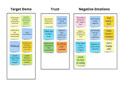
Branding Synthesis
Click image to enlarge
As we synthesized the results of our branding interviews into an affinity map, we were able to get an idea of how participants felt about the subject matter.
This provided us with branding direction on where we wanted to go with designing the website.
Takeaways:
Participants felt TC[D]B would largely attract:
-
People of color
-
Those under approx. 40 years old
-
Those already aligned with their cause
Participants described an activist feeling that may drive away certain demographics. This was reinforced by the dramatic imagery and use of dark colors.
Participants suggested more uplifting imagery may be attractive to "outsiders."
Participants felt trust can be gained when they can see that the brand is already trusted by peers or other organizations, or if they take notable actions.
User Research - Competitor Contextual Inquiry
For the second part of our user research, we conducted contextual inquiries with four participants by having them navigate three competitor websites as we recorded their experiences.
Sites Analyzed:
Digital Undivided

True North

Project Include

We wanted to see what navigational features people look for in a website in order to direct the layout of content on the website we were building and make sure people would be able to find what they were looking for.
We followed up the contextual inquiry with interview questions such as:
-
Where do you look to find information on a website?
-
Where do you have issues finding the information that you require?
-
What navigation works for you?
-
What did you struggle with the most?
Competitor Contextual Inquiry - Synthesis

Click image to enlarge
Takeaways:
As we synthesized the data from the contextual inquiry interviews, we focused our attention on layout pain points, user needs and navigational likes. We deduced that people wanted:
-
A clear mission statement/What the organization is about
-
Clear intent of the organization and how it can help
-
Actionable and measurable solutions offered
-
Tell me why they should be trusted
Competitive/Comparative Analysis
Following the contextual inquiry, we conducted a competitive/comparative analysis of the following sites:
True North EDI
Project Include
Black Employee Network
Hack-the-Hood
N Power
Digital Undivided
Takeaways:
Our analysis of competitor/comparator data provided information showing:
-
Reliance on imagery to enforce their message
-
All competitors focuse on a specific target audience
-
2 out of 3 competitors offer career training/mentorship
-
2 out of 3 competitors offered a diverse hiring pool
-
None of the direct competitors offer job search assistance
Persona - Tech Community Member
![TC[D]B Community Member persona](https://static.wixstatic.com/media/d8ed12_31064ff89b71414aa8c7dcfb64cc8a5a~mv2.jpg/v1/crop/x_177,y_152,w_688,h_999/fill/w_192,h_280,al_c,q_80,usm_0.66_1.00_0.01,enc_avif,quality_auto/Persona2.jpg)
Anthony Wright
Age
25 Years Old
Location
Austin, TX
Education
Bachelor's Degree
"Brands need to back up what they put out."
Bio
Anthony is a web developer for a tech company and feels that tech could be doing more. He is committed to activate his company to socialize the need for change within his company.
Needs
Needs the tools necessary to push for and implement change in his community.
Needs to establish a brand that focuses on helping each other with an idea that would gain trust.
Goals
Creating action to make change in the workplace.
Tagline
"You can't make change alone."
Behaviors
Anthony wants to help members of the tech community be recognized and is tired of how companies treat diversity.
Frustrations
Difficulty in getting companies to recognize diversity
Disconnected from and jaded by the tech industry
Problem Statement
Tech community members need a way to find actionable information so that they can implement change in their workplace.
Possible Solutions:
-
Organize the information supplied by TC[D]B in a way that will be easily accessed by those aligned with their cause.
-
Provide access to thought leadership as it is produced.
-
Articulate the benefits of formally aligning with TC[D]B in order to take action and affect policy.
Wireframing

Click image to enlarge
To get a vision of our design direction, we drew sketches of the initial landing page to see how we would lay out content for further development.


Click images to enlarge
As we further developed the design of the landing page, we incorporated TC[D]B's marketing content and style guide that was provided.
We started with darker colors and more intense imagery which then led us to use lighter colors and more uplifting images to feature.
Global Navigation Outline

Click image to enlarge
The next step in determining our design direction was how to layout content on the site.
We performed a copy audit of the copy materials provided, which was organized into landing page headers-one page per header.
We wanted to establish "Who, Why, What and How" in order to represent TC[D]B the most effectively on the website.
Sitemap - Current MVP and Planned Expansion

Click image to enlarge
Once we established our global navigation header layout, we built a sitemap for the current site as well as capabilities that the website could offer in the future.
Information Architecture
First Stage

Second Stage

Third Stage

Click images to enlarge
To begin laying out the content for header pages, we first compiled copy materials from different sources into a structure that was dictated by the global navigation.
Secondly, we broke up information into sub-sections with marketing images interspersed among them. Sub-headers were placed as well as fonts from the direction of the style guide.
At the third stage, we incorporated more style templates and added placeholder images. A hierarchy was established and this stage of the process set a template for our other pages on the website.
Final Stylization
Click image to enlarge
Final Prototype
Here is the final clickable prototype that we created in Sketch.
Key Learnings & Next Steps
Since TC[D]B is in the beginning stages of creating their website, we gave them a template to start with which they can build upon. They wanted a site that could be built out to incorporate new team members and new content as it became available.
Their vision of the future of the site would expand upon the community member persona, where they would further reach out to network members and corporate alliances to broaden their scope.